Con-Script Development Centre

A forum for all topics related to constructed languages
User avatar
Taurenzine
cuneiform
cuneiform
Posts: 195
Joined: 03 Oct 2016 17:29

Re: Con-Script Recycling Bin and Idea Box

Post by Taurenzine »

Shemtov wrote:
AndivahXevos wrote:
Shemtov wrote:This is an abugida for scrapped tone language of mine:
Feel free to use it as long as you give me full credit!
I quite like the names for the letters as well as the overall idea.

I'm curious about how you created your letters and marks. Also, did you make any words or grammar system for it?
It was made for a civilization that was influenced by Malays and Thai, so most of it comes from the Jawi and Thai scripts.
Here's the thread for the language, before it was scrapped:
viewtopic.php?f=6&t=3273&p=132653&hilit=hengese#p132653

Also, here's another script I created, but I'm using it right now. But it's OK if someone would take a few graphemes from it, if their stuck.:
Image
It's an alphabet, read left-to-right.
Omg did u do wwII that swastika tho

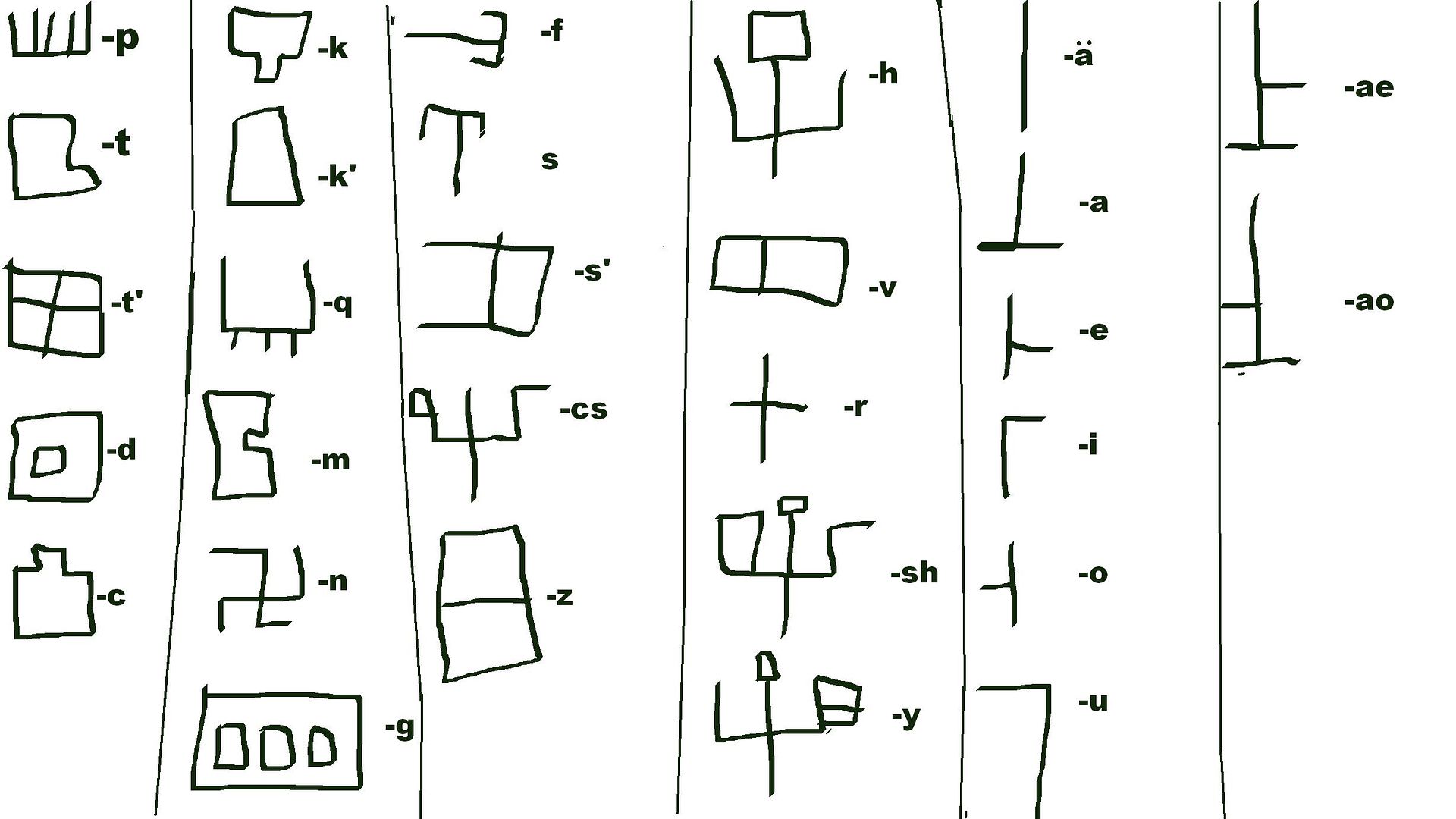
EDIT: I was joking, but for some real input, I would say touch up on the alphabet a bit... if its hard to draw on a computer with a mouse, then try drawing in on paper and taking a photo then posting it. this version is somewhat sloppy.
Last edited by Taurenzine on 29 Jan 2017 22:17, edited 1 time in total.
User avatar
Taurenzine
cuneiform
cuneiform
Posts: 195
Joined: 03 Oct 2016 17:29

Re: Con-Script Development Centre

Post by Taurenzine »

OTʜᴇB wrote:
masako wrote:A longer sample would be nice when you get a chance. Also, I would challenge you to simultaneously create a handwritten/calligraphic version. That would be a real treat.
Certainly. In terms of a calligraphic version, because of the theme of it, what I have would be a calligraphic version. I mentioned the tapered square-tip pen, as that would be the calligraphers' tool of choice to reproduce the even lines and perfect corners - the calligraphic version is basically the computer version on paper. Hand-written, that same sample would look a bit like this:
Spoiler:
Image
Of course as I get better at writing it, it will start to look increasingly clumsy and more realistic to what a handwritten form would actually look like, but the point is that it follows specific proportions and distances and angles etc.
You've done very well on this, I must say. Its a great writing system, might even try learning it myself.
User avatar
mira
greek
greek
Posts: 759
Joined: 14 May 2016 11:59
Location: Switzerland
Contact:

Re: Con-Script Development Centre

Post by mira »

Taurenzine wrote:
OTʜᴇB wrote:
masako wrote:A longer sample would be nice when you get a chance. Also, I would challenge you to simultaneously create a handwritten/calligraphic version. That would be a real treat.
Certainly. In terms of a calligraphic version, because of the theme of it, what I have would be a calligraphic version. I mentioned the tapered square-tip pen, as that would be the calligraphers' tool of choice to reproduce the even lines and perfect corners - the calligraphic version is basically the computer version on paper. Hand-written, that same sample would look a bit like this:
Spoiler:
Image
Of course as I get better at writing it, it will start to look increasingly clumsy and more realistic to what a handwritten form would actually look like, but the point is that it follows specific proportions and distances and angles etc.
You've done very well on this, I must say. Its a great writing system, might even try learning it myself.
Thanks. If you want to learn it as part of the language I'd happily PM you when I have a language to teach.
website | music | she/her | :gbr: native :deu: beginner
jimydog000
greek
greek
Posts: 594
Joined: 19 Mar 2016 04:14
Location: Australia

Re: Con-Script Development Centre

Post by jimydog000 »

More logograms, guess what they mean! kinda unhappy about a few but figuring out a height pattern should fix it I guess
Spoiler:
Image
A signature.
User avatar
Ahzoh
mongolian
mongolian
Posts: 4200
Joined: 20 Oct 2013 02:57
Location: Canada

Re: Con-Script Development Centre

Post by Ahzoh »

jimydog000 wrote:More logograms, guess what they mean! kinda unhappy about a few but figuring out a height pattern should fix it I guess
Spoiler:
Image
I have no clue what they mean, but they are aesthetically pleasing.
Image Śād Warḫallun (Vrkhazhian) [ WIKI | CWS ]
User avatar
All4Ɇn
mayan
mayan
Posts: 1766
Joined: 01 Mar 2014 07:19

Re: Con-Script Development Centre

Post by All4Ɇn »

jimydog000 wrote:More logograms, guess what they mean! kinda unhappy about a few but figuring out a height pattern should fix it I guess
Spoiler:
Image
Nice! I'm gonna guess:
tongue, lantern, nose, tree, apple, person, sun, moon, squid, mountain, house, family, rain, foot, fire, woman, spear, fly, snail, eye, up, down, water, chair, table
jimydog000
greek
greek
Posts: 594
Joined: 19 Mar 2016 04:14
Location: Australia

Re: Con-Script Development Centre

Post by jimydog000 »

All4Ɇn wrote:
jimydog000 wrote:More logograms, guess what they mean! kinda unhappy about a few but figuring out a height pattern should fix it I guess
Spoiler:
Image
Nice! I'm gonna guess:
tongue, lantern, nose, tree, apple, person, sun, moon, squid, mountain, house, family, rain, foot, fire, woman, spear, fly, snail, eye, up, down, water, chair, table
Ahahaha! You got 3 right and interestingly guessed 10 for the wrong glyph instead of another.

Down, middle, fire, tree, sea/water, sun, balance, water/lake (simplified from a ripple shape), air (used to be more swirly), house (I realised how much it looks like mountain after posting), up, astral, gate, foot, animal track/foot, break (snapping string), seed, bug, head, eye, inside, outside, rain, man, woman.
A signature.
User avatar
mira
greek
greek
Posts: 759
Joined: 14 May 2016 11:59
Location: Switzerland
Contact:

Re: Con-Script Development Centre

Post by mira »

jimydog000 wrote:More logograms, guess what they mean! kinda unhappy about a few but figuring out a height pattern should fix it I guess
Spoiler:
Image
(left to right, top to bottom):
Lamp, [expleted], Smoke, Tree, almost 5... so 4?
Radar, Half-pipe, Some kind of pastry, duel of noses, Pyramids,
Shelves, ?, Falling, Impressionist nose, surprised worm,
that thing bad guys do with their hands (tapping fingers together), Sweetcorn kernel, bi-directional microphone, loop-de-loop!, blindness,
Jar with spoon, spilled jar with spoon, table (yet to be assembled), table (now assembled), pi.

How well did I do? [:D]
website | music | she/her | :gbr: native :deu: beginner
User avatar
Man in Space
roman
roman
Posts: 1309
Joined: 03 Aug 2012 08:07
Location: Ohio

Re: Con-Script Development Centre

Post by Man in Space »

I know I'm late to the party here, but…
cedh wrote:So far, so good. However, Ndak Ta has fairly frequent word-final clusters /pm bm tn dn tsn kŋ gŋ/ with phonetically syllabic nasals. Word-initial syllabic nasals are already covered with the "prenasalised" syllable glyphs. Since none of the relevant clusters occur non-finally (and all syllable glyphs are supposed to derive from earlier word-initial readings of logograms), I find it hard to come up with a plausible way for writing them. Options include:
- double echo vowels (i.e. /mabm/ <MA-PA-MA>)
- four separate glyphs for all N= syllables, disregarding voicing (i.e. /mabm/ <MA-PM>)
- three separate glyphs for syllabic /m n ŋ/ (i.e. /mabm/ <MA-PA-M>)
- one separate glyph for abstract N= (i.e. /mabm/ <MA-PA-N=>)
- add five glyphs for nasalised V~ syllables (which can also be used in other positions), and use them as echo vowels (i.e. /mabm/ <MA-PA-A~>)
- ...
Which of these do you consider most likely? most interesting? most pleasing? Any other ideas?

Thanks a lot in advance!
You could rip off Sumerian and Mayan and just leave them "underspelled", i.e. not marking it at all and having to infer from context. More complex and confusing? Yes, but it's a realistic system.
Twin Aster megathread

AVDIO · VIDEO · DISCO

CC = Common Caber
CK = Classical Khaya
CT = Classical Ĝare n Tim Ar
Kg = Kgáweq'
PB = Proto-Beheic
PO = Proto-O
PTa = Proto-Taltic
STK = Sisỏk Tlar Kyanà
Tm = Təmattwəspwaypksma
User avatar
LinguoFranco
greek
greek
Posts: 615
Joined: 20 Jul 2016 17:49
Location: U.S.

Re: Con-Script Development Centre

Post by LinguoFranco »

I have a conscript that I'm not satisfied with. Nothing wrong with it itself, it just looks to cursive for my liking. It's an syllabary with characters that look like a blend of English cursive and hiragana.

I'm trying to figure out what kind of writing script I should go for. The syllable structure, for now at least, is CV(C), but it might become (C)CV(C). There are four coda consonants.

As for the basic structure of the language, it is agglutinative, but will eventually become fusional.
User avatar
mira
greek
greek
Posts: 759
Joined: 14 May 2016 11:59
Location: Switzerland
Contact:

Re: Con-Script Development Centre

Post by mira »

LinguoFranco wrote:I have a conscript that I'm not satisfied with. Nothing wrong with it itself, it just looks to cursive for my liking. It's an syllabary with characters that look like a blend of English cursive and hiragana.

I'm trying to figure out what kind of writing script I should go for. The syllable structure, for now at least, is CV(C), but it might become (C)CV(C). There are four coda consonants.

As for the basic structure of the language, it is agglutinative, but will eventually become fusional.
Abjad maybe as your consonants vary where vowels don't. Maybe try an alphasyllabary as it works well where options are few but varied.
website | music | she/her | :gbr: native :deu: beginner
User avatar
LinguoFranco
greek
greek
Posts: 615
Joined: 20 Jul 2016 17:49
Location: U.S.

Re: Con-Script Development Centre

Post by LinguoFranco »

OTʜᴇB wrote:
LinguoFranco wrote:I have a conscript that I'm not satisfied with. Nothing wrong with it itself, it just looks to cursive for my liking. It's an syllabary with characters that look like a blend of English cursive and hiragana.

I'm trying to figure out what kind of writing script I should go for. The syllable structure, for now at least, is CV(C), but it might become (C)CV(C). There are four coda consonants.

As for the basic structure of the language, it is agglutinative, but will eventually become fusional.
Abjad maybe as your consonants vary where vowels don't. Maybe try an alphasyllabary as it works well where options are few but varied.
One more question. It is going to read from top to bottom, left to right. Do you know of any other scripts that do this besides Mongolian so I can get a feel for how the characters/letters are designed?
User avatar
mira
greek
greek
Posts: 759
Joined: 14 May 2016 11:59
Location: Switzerland
Contact:

Re: Con-Script Development Centre

Post by mira »

LinguoFranco wrote:
OTʜᴇB wrote:
LinguoFranco wrote:I have a conscript that I'm not satisfied with. Nothing wrong with it itself, it just looks to cursive for my liking. It's an syllabary with characters that look like a blend of English cursive and hiragana.

I'm trying to figure out what kind of writing script I should go for. The syllable structure, for now at least, is CV(C), but it might become (C)CV(C). There are four coda consonants.

As for the basic structure of the language, it is agglutinative, but will eventually become fusional.
Abjad maybe as your consonants vary where vowels don't. Maybe try an alphasyllabary as it works well where options are few but varied.
One more question. It is going to read from top to bottom, left to right. Do you know of any other scripts that do this besides Mongolian so I can get a feel for how the characters/letters are designed?
I don't know of any, but the design relies on a lot of other things more than direction.
website | music | she/her | :gbr: native :deu: beginner
User avatar
Shemtov
runic
runic
Posts: 3286
Joined: 29 Apr 2013 04:06

Re: Con-Script Development Centre

Post by Shemtov »

The vowel series of the Fuheko syllabary:
Image
What do people think?
Many children make up, or begin to make up, imaginary languages. I have been at it since I could write.
-JRR Tolkien
User avatar
eldin raigmore
korean
korean
Posts: 6354
Joined: 14 Aug 2010 19:38
Location: SouthEast Michigan

Re: Con-Script Development Centre

Post by eldin raigmore »

jimydog000 wrote:More logograms, guess what they mean! kinda unhappy about a few but figuring out a height pattern should fix it I guess
Spoiler:
Image
Maybe it only shows that it's been too long for me, but the one on the bottom left reminds me of "the plow", and the one just to its right reminds me of "doggy-style".
User avatar
Ahzoh
mongolian
mongolian
Posts: 4200
Joined: 20 Oct 2013 02:57
Location: Canada

Re: Con-Script Development Centre

Post by Ahzoh »

I developed some symbols for Onschen's syllabary, now called Aryuxa!on. The text below is the name of the country TU-SON-STSA-GON:
Image
I think I made it too thick.

Also, how would I go about making logoglyphs that represent the second and third persons?
Image Śād Warḫallun (Vrkhazhian) [ WIKI | CWS ]
User avatar
Man in Space
roman
roman
Posts: 1309
Joined: 03 Aug 2012 08:07
Location: Ohio

Re: Con-Script Development Centre

Post by Man in Space »

Ahzoh wrote:Also, how would I go about making logoglyphs that represent the second and third persons?
However you think a reasonable representation or metaphor might come about. Common Caber uses stylized pictures of two people facing each other with the one on the right pointing to the referent—himself for first person, the guy on the left for second, and off somewhere else for third. The third-person female pronoun is indicated by appending the glyph for "woman" after it.
Twin Aster megathread

AVDIO · VIDEO · DISCO

CC = Common Caber
CK = Classical Khaya
CT = Classical Ĝare n Tim Ar
Kg = Kgáweq'
PB = Proto-Beheic
PO = Proto-O
PTa = Proto-Taltic
STK = Sisỏk Tlar Kyanà
Tm = Təmattwəspwaypksma
User avatar
Thrice Xandvii
runic
runic
Posts: 2698
Joined: 25 Nov 2012 10:13
Location: Carnassus

Re: Con-Script Development Centre

Post by Thrice Xandvii »

Ahzoh wrote:I developed some symbols for Onschen's syllabary, now called Aryuxa!on. The text below is the name of the country TU-SON-STSA-GON:
Image
I think I made it too thick.
Aside from it looking a lot like Vrkhazian and needing considerable smoothing (did you stretch it to make it bigger?), I like it. [:)]
Image
User avatar
Ahzoh
mongolian
mongolian
Posts: 4200
Joined: 20 Oct 2013 02:57
Location: Canada

Re: Con-Script Development Centre

Post by Ahzoh »

Thrice Xandvii wrote:
Ahzoh wrote:I developed some symbols for Onschen's syllabary, now called Aryuxa!on. The text below is the name of the country TU-SON-STSA-GON:
Image
I think I made it too thick.
Aside from it looking a lot like Vrkhazian and needing considerable smoothing (did you stretch it to make it bigger?), I like it. [:)]
It is derived from the same writing system and probably going to look very similar on stone carving and metal work.
These are some of the other letters:
http://i.imgur.com/mP7ezEl.png

The program is bad at smoothing when you increase the font size, even though it's suppose to be vector.
Image Śād Warḫallun (Vrkhazhian) [ WIKI | CWS ]
User avatar
eldin raigmore
korean
korean
Posts: 6354
Joined: 14 Aug 2010 19:38
Location: SouthEast Michigan

Re: Con-Script Development Centre

Post by eldin raigmore »

Ahzoh wrote:...It is derived from the same writing system and probably going to look very similar on stone carving and metal work....
Aren't curves rather hard to carve on stone?
Ahzoh wrote:These are some of the other letters:
http://i.imgur.com/mP7ezEl.png
The program is bad at smoothing when you increase the font size, even though it's suppose to be vector.
IMO they look very nice!
But have you considered how much, and in what ways, the medium will influence the writing-system?

[nonserious] Or whether your culture can have a breakfast cereal equivalent to Alpha-Bits? No non-connected glyph could be included. [/nonserious]
Post Reply